I became interested in the mobile space when I got my first iPod Touch. I ended up browsing the web more on my mobile device which inspired me to make webpages compatible for the small screens.
What started out as a small side-project turned out to be a big project the Libraries wanted to roll out in the Fall quarter. I worked on a mobile layout on and off in the months of July and August. As our web committee discussed the needs of our Library patrons, a mobile version of our website was on top of our wishlist to be rolled out by Fall Quarter.
My Involvement:
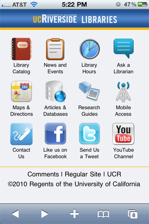
I took the lead in this project and worked on creating a template and layout proposal that helped brand the UCR Libraries. The next step was to build static content we could use on the mobile website. The Web Committee and I researched what other Libraries were featuring on their mobile websites. We also did a small usability study and asked our patrons what they would like on it. Some of the important functions were the Library catalog, news and events, hours, Ask-a-Librarian chat, access to electronic databases, and social networking.
In addition to the functions requested, pages like Maps and Directions, Floor Maps and Call Numbers, Research Guides (subject and class guides), Mobile Access, Workshop Sign-up, Contact Us, and About Us (includes Borrowing Privileges, Printing, Copying, and Scanners in the Libraries) were created.
The website was tested on various phones – iPhones, Android, Blackberry, Windows Mobile, and Palm OS. There were some display problems in older versions of Blackberry RIM and Windows Mobile, but the other smartphones worked fine. I’m looking to remedy this in the future.
The mobile website was launched on Oct. 5th and is continually updated and refined as we get suggestions.
Impact:
The Library Mobile website receives an average of 150 unique visitors a day and 2,500+ Pageviews a week. Besides the main page, our most popular pages are the hours, room reservation system, and searching the reserves material and books in the catalog.
The mobile website was well-received and greatly impacted the way Circulation provided service to our patrons. Patrons were able to quickly search for reserve materials on their phone to show our Circulation staff the call numbers they needed. They no longer had to wait in front of the Kiosk computers to search and write down call numbers. The mobile room reservation system is also heavily used. Patrons were really happy to be able to reserve study rooms right on their phones without needing a computer. Patrons could also quickly look up the current Library hours on their phones, so they don’t ask the “when will the Library close?” question as frequently.
The mobile website was also 1 out of 6 Library Mobile Websites mentioned in College & Research Libraries News, Volume 72, No. 4, April 2011 as a good example of a mobile Library website.
Timeline: July 2010 – October 2010
Screenshots


Website:
(No longer exists).
or scan this QR code on your phone:
Future Plans:
I’m planning to work with the UCR Campus to move our mobile site over using UCLA’s mobile Framework. I like what they’ve done and appreciate how the mobile website degrades really well for non-smartphone users.
I will also work on retina-display-compatible graphics for those using iPhone 4.
Credit:
For the news banners and announcements, I created an image with the various smartphones. The smartphone images were PSD files generously made for this purpose. You can find the PSD files at:
These were also used in my presentation. Thank you!
Pingback: Mobile Library Web App « Daynah.net